
Last Updated on August 22, 2026
Stand in the concourse of a major interchange at half past eight in the morning and you can watch two entirely different activities sharing one floor.
Most people are doing. They are moving from a train to a gateline, a gateline to a stair, a stair to the street, and the only thing they want from the environment is that it does not delay them. A minority are being. They are waiting under the departure board, drinking coffee, sitting on a step, meeting somebody, spending twenty minutes they allowed for on purpose. Same square metres, same density reading, two incompatible definitions of success.
Every pedestrian simulation in commercial use models the first group with real sophistication and treats the second as an obstacle.
The reason goes back to 1971, and to a coincidence. Three books that shaped how we understand people in space appeared within a decade of each other, and one of them won. John Fruin’s Pedestrian Planning and Design gave the world the pedestrian level of service concept — density bands A to F, derived from the speed-density-flow relationship, measured by time-lapse photography. Jan Gehl’s Livet mellem husene argued that the life of a public space consists of necessary activities, optional activities and social activities, and that only the first is compulsory. Gordon Cullen’s Townscape, reissued in abridged form the same year, gave us serial vision and the reading of place as a sequence of experiences.
Fruin was in English immediately and entered engineering practice worldwide. Gehl waited sixteen years for an English edition. Cullen went to the designers. The measurement paradigm for doing got a generation’s head start on the vocabulary for being, and pedestrian modelling has never closed the gap.
Stations are where the cost of that gap is highest, because a station is the one environment that has to serve both modes at once, in the same envelope, under time pressure, for people who mostly do not know where they are.
What does level of service actually measure?
It is worth stating plainly how consistent the global picture is, because the consistency is the problem.
In the United States, the Highway Capacity Manual, 7th edition (Transportation Research Board, 2022) sets pedestrian level of service in Chapter 24 on space per pedestrian. In Germany, the Handbuch für die Bemessung von Straßenverkehrsanlagen (FGSV, 2015) grades pedestrian facilities in Chapter S9 by Qualitätsstufen des Verkehrsablaufs — quality levels A to F, on density, with separate values for moving and waiting pedestrians. The German pedestrian design recommendations, Empfehlungen für Fußgängerverkehrsanlagen (FGSV, 2002), refer the capacity question out to that handbook. In the United Kingdom, Network Rail’s Station Capacity Planning design manual, NR/GN/CIV/100/03, applies Fruin bands element by element, and Transport for London’s Pedestrian Comfort Guidance grades footways in pedestrians per metre per minute. In shipping, IMO MSC.1/Circ.1533 sets specific flow limits and flags congestion above about three and a half persons per square metre. In aviation, the IATA level of service framework in the Airport Development Reference Manual is defined on space per passenger, maximum queueing time and seating.
Six jurisdictions, four modes, one variable. Every one of these instruments measures how tightly bodies are packed and how fast they can be moved through. Not one of them contains a criterion for noise, light, air quality, thermal comfort, acoustics, view, greenery or the availability of somewhere to sit. Network Rail’s manual is silent on sensory conditions apart from weather protection. TfL defines comfort purely as a crowding rate. Fruin’s own 1971 title promised a concept resting on qualitative as well as quantitative factors. The quantitative half was standardised. The qualitative half was not.
Why are stations the hardest case for pedestrian simulation?

A street can be mostly about being. A stadium is unambiguously about being. A motorway is entirely about doing. A station is the only common environment that has to be both, simultaneously, in a shared envelope — and it compounds the difficulty in six specific ways that current simulation handles poorly or not at all.
Both modes occupy the same floor. A retail concourse is designed to slow people down and a platform interface is designed to clear them. Those two intentions are metres apart and the model reports a single density figure across both.
Most users are not habitual. A high proportion of people in any large interchange are unfamiliar with it, and unfamiliarity converts spatial ambiguity into cognitive load. This matters more than it sounds, because of a finding from aviation: when Wu, Morlotti and Mantin examined eighty-nine US airports, the revenue effect of dwell time was moderated by terminal form — strong in linear layouts, absent in concourse designs — which they attribute to orientation confidence. Passengers who are not certain they can reach the gate do not stop. Optional behaviour only appears once the necessary behaviour feels secure. Wayfinding is therefore not a service nicety sitting alongside capacity; it is the precondition for every commercial and experiential outcome in the building.
Bodies are not standard. Luggage, pushchairs, mobility aids, groups travelling together, children being supervised. Fruin’s body ellipse and the walking speed distributions in most default parameter sets describe an unencumbered adult travelling alone, which in a mainline station is a minority case.
Time pressure is asymmetric. A departing passenger has a hard deadline and a tolerance for discomfort that collapses as it approaches. An arriving passenger frequently has neither. The same corridor at the same density is a different experience depending on which direction you are walking, and no level of service band distinguishes them.
The crowd changes regime. On a Tuesday morning the concourse holds commuters, who are not a psychological crowd in any meaningful sense — no shared identity, no mutual recognition, and density experienced as pure cost. After a match or a concert the same concourse holds a genuine psychological crowd, for whom the evidence says density works differently and can even read as reassuring. Our models treat both as the same population.
Sensory conditions are extreme and entirely unmeasured. Stations are frequently reverberant, artificially lit, without daylight or view, with poor acoustic separation between announcement, retail and conversation. These are precisely the variables that no pedestrian capacity standard in any jurisdiction carries — and, as the later sections show, precisely the variables for which rigorous measurement standards already exist in other disciplines.
To which one more should be added, because it is the least obvious. A station is a townscape. It has frontage, sightlines, proportion, enclosure and rhythm, exactly as a street does. A concourse with a legible edge of small units and many openings behaves differently from one with a blank wall and two large retail boxes, at identical density. That variable is measurable and it is not being measured.
Why does level of service rate an empty street as the best possible outcome?
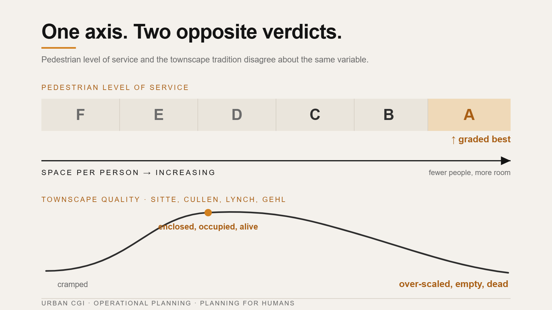
There is a deeper problem than omission, and it sits in the shape of the scale itself. Level of service is monotonic in space per person. More room is always a better grade. Which means the top of the scale, LoS A, free circulation, describes a street with almost nobody on it.
Put that in front of anyone from the townscape tradition and they will tell you it is a description of failure.
The tradition is older than Fruin by seventy years. Camillo Sitte’s Der Städtebau nach seinen künstlerischen Grundsätzen, published in Vienna in 1889, contains a chapter titled The Enclosed Character of the Public Square, and Sitte attributed an outbreak of agoraphobia to the emptiness and vast extent of the spaces carved out by modern thoroughfares such as the Ringstrasse. The founding text of the enclosure tradition diagnoses over-scaled, under-occupied space as pathogenic. Our capacity standards grade it A.
Kevin Lynch’s The Image of the City, MIT Press, 1960, gave the discipline imageability and the five elements through which people hold a city in mind: paths, edges, districts, nodes and landmarks. Gordon Cullen’s Townscape, Architectural Press, 1961 — abridged and reissued as The Concise Townscape in 1971, the same year as both Fruin and Gehl — gave it serial vision, the sequence of the existing view and the emerging view revealed in jerks as a pedestrian walks; here and there; place and content. Cullen’s understanding of place rests explicitly on the opposition of exposure and enclosure. He also left the sharpest available indictment of the mindset that produced level of service: we have to rid ourselves of the thought that the excitement and drama that we seek can be born automatically out of the scientific research and solutions arrived at by technical man.
Bentley, Alcock, Murrain, McGlynn and Smith’s Responsive Environments, Architectural Press, 1985, set out seven qualities for designers — permeability, variety, legibility, robustness, visual appropriateness, richness and personalisation. Enclosure is not among the seven, and it is worth being accurate about that. What matters is that every one of the seven concerns choice, activity and use, and not one of them is measured by any capacity standard in the world.
So the intellectual tradition of place has held, consistently for over a century, that a degree of enclosure and a degree of occupation are positive attributes. And engineering practice has held, equally consistently, that space is a good to be maximised. That is not a difference of emphasis. The two disciplines assign opposite signs to the same variable. It is the mono-dimensional habit — more space is better, always, everywhere — and it produced the windswept plazas and over-scaled precincts of the modernist era that cities have spent forty years quietly correcting.
The station consequence is direct. Widening a concourse, removing a colonnade, replacing a run of small units with a single large one, opening up a mezzanine void — each of these improves every capacity metric in the assessment and each may make the space worse to be in. Nothing in the standard can register the loss, so the loss is invisible until the building opens.
What did Melbourne actually prove?

Melbourne is the closest thing the field has to a controlled experiment, which is why it is worth citing precisely rather than loosely.
In 1994, a City of Melbourne study conducted with Jan Gehl described the central city as empty and useless. Note the word. Empty is the condition level of service rewards. The City had launched Postcode 3000 in 1992 to convert vacant office stock to housing, and pursued a sustained laneway and streetscape programme under Rob Adams.
The follow-up study, Places for People 2004, measured what changed over the decade. Weekday pedestrian traffic rose thirty-nine per cent during the day and ninety-eight per cent in the evening. Central city dwellings went from 736 in 1992 to 9,900 in 2002. The accessible, active laneway network grew from about 300 metres to 3.4 kilometres. Stationary activity — standing, sitting, sitting outside cafés — increased considerably. Melbourne then held first place in the Economist Intelligence Unit’s global liveability ranking for seven consecutive years, from 2011 to 2017, before Vienna displaced it.
The laneways are the point. They are narrow, hard-surfaced, highly enclosed, and by any conventional footway assessment they are constrained. They are also the most valued pedestrian environments in the city, and the venue for its festivals — St Jerome’s Laneway Festival began in Caledonian Lane in 2005 and became an international touring brand. The same is true of the cobbled lanes of European and Italian towns that everybody claims to love. Widen them and you would destroy them, while improving every capacity metric.
The transferable lesson for stations is that the laneway is the model for a concourse edge, not the corridor. Narrow, enclosed, densely fronted, and highly tolerant of crowding because everything about it tells you that being there is the point.
Has anyone tried to fix this?

Yes, twice, and the profession did not follow.
The best statement of the problem is in a City of Melbourne technical report. Reviewing international practice for the city’s Walking Plan in 2012, Mia Pantzar wrote that Fruin’s model is too simplified and needs to be better adapted to real pedestrian realms — noting that Fruin rates an empty street as LOS A, even though pedestrians might not desire a completely empty street. A municipal transport document said the quiet part out loud fourteen years ago.
Before that, Frank Jaskiewicz proposed a solution. In Pedestrian Level of Service Based on Trip Quality, published in a Transportation Research Board circular in 1998, he set out nine measures of trip quality — and the first of the nine is enclosure and definition. His criterion: good enclosure dictates that the pedestrian’s eyes are focused along the street rather than among the blank spaces between, behind or in front of buildings. That is Cullen, rendered as a level of service variable, in 1998. It was not adopted.
And the measurement problem has since been solved by someone else entirely. Ewing and Handy’s Measuring the Unmeasurable: Urban Design Qualities Related to Walkability, in the Journal of Urban Design in 2009, took eight candidate urban design qualities to an expert panel rating filmed street scenes, and successfully operationalised five of them against tests of validity and reliability: imageability, enclosure, human scale, transparency and complexity. Legibility and linkage failed. Enclosure is therefore one of exactly five urban design qualities in the literature with a validated, reliable, field-measurable protocol, published as field instruments in Measuring Urban Design: Metrics for Livable Places in 2013. It has since been automated from street imagery at city scale.
Enclosure is measurable. It has been measurable for fifteen years. No pedestrian capacity standard and no commercial simulation package uses it. Transport for NSW’s Movement and Place framework comes closest and is the most revealing case of all: it contains a Street Enclosure indicator, using a street aspect ratio that explicitly flags streets below 0.5 to 1 as likely to lack definition — and, separately, a Pedestrian Crowding indicator. Both live in one government framework. Neither enters the other’s calculation. Nothing trades them off.
The pieces have been sitting on the table for a quarter of a century. Nobody has assembled them.
Can we measure the rhythm of a street?

Enclosure is only half of the morphological account. The other half is rhythm.
The tradition here is British and older than most people in transport realise. M.R.G. Conzen’s Alnwick, Northumberland: A Study in Town-Plan Analysis, published by George Philip as Institute of British Geographers Publication 27 in 1960, founded the Conzenian school of urban morphology by decomposing an English town into three form complexes: the town plan, comprising streets, plots and the block plans of buildings; the building fabric; and land and building utilisation. It is a method for reading character out of physical form rather than out of use class. Bill Hillier and Julienne Hanson’s The Social Logic of Space, Cambridge University Press, 1984, then gave the field space syntax, and Hillier and colleagues’ 1993 paper on natural movement made the argument that reverses conventional practice: the configuration of the street grid is itself the primary generator of pedestrian movement, and attractor land uses locate to exploit movement that is already there. Movement first, attractors second.
Note the dates. Conzen and Lynch in 1960, Jacobs and Cullen in 1961, Hillier and Hanson in 1984, and Fruin, Gehl and the Concise Townscape in 1971. Everything needed to understand pedestrian experience was written between 1960 and 1985. Only the capacity half was operationalised.
Rhythm is the variable Gehl actually measures, and he measures it far more precisely than his reputation for soft observation suggests. The façade evaluation scale published in Gehl, Kaefer and Reigstad’s Close Encounters with Buildings, Urban Design International, volume 11, 2006, at page 41 — developed originally for Stockholm and used in the 1994 Melbourne study — grades ground floor frontage from A to E on a countable metric: doors per hundred metres. A quality is fifteen to twenty doors per hundred metres, with small units, large variation in function, no blind frontages and strong vertical articulation. E quality is zero to two doors per hundred metres, large units, blind or passive frontage, uniform façades with no relief and, in Gehl’s phrase, nothing to look at. The design rule he draws from it is a minimum of ten doorways per hundred metres of façade to create life at eye height.
That is a hard number for a quality every capacity standard treats as outside its scope. A street can be graded A for pedestrian level of service and E for frontage rhythm simultaneously, and those two letters are describing the same place.
The author’s doctoral thesis, Spatial Urbanism: Public Space Typology as Urban Planning Zones (Anglia Polytechnic University, 2005), pursued exactly this line across an entire English town. Working in Norwich — a city that claims to be the most complete medieval settlement in the United Kingdom, and which had fifty-seven churches inside its walls, of which thirty-one survive — it proposed a deliberately simple morphological description of placeness in three dimensions: the proportion of building height to the width of the space between, giving enclosure; the rhythm of the street edge, counted as doorways, edges and changes of plane along it; and the resulting character, which can be zoned across a whole town as a public space typology — a spatial classification of what a place is like, running in parallel to, and capable of doing work that conventional land-use zoning cannot do. Two streets with identical land-use designations, identical widths and identical footfall can have entirely different character, and the difference is legible in the proportion and the rhythm. The thesis mapped that character across the full extent of the town, from highway-scaled space to intimate laneway, and treated the transition between the two as the object of study rather than as noise.
The reason this matters commercially is that it is computable. Height-to-width ratio is derivable from any digital surface model. Doorway and frontage rhythm is derivable from street imagery, and has been automated. Both variables already exist in the datasets that pedestrian modelling projects routinely purchase and then use only for collision geometry.
The empirical case sits in plain sight in East London. Columbia Road, on the council’s own description, carries around sixty independent shops along a few hundred metres of frontage — an order of magnitude that puts it firmly in Gehl’s A band — and on a Sunday it sustains dwelling, browsing and stationary activity at densities that would fail any comfort assessment written. The rhythm is doing the work. Widen the street, consolidate the units, and every capacity metric improves while the place dies.
Applied to a station, the same measure separates a concourse that works from one that merely flows. Count the openings per hundred metres of concourse edge and you have a number that predicts dwelling, orientation and commercial performance, computable from a drawing, and absent from every capacity assessment written.
Is going slower always worse?
Here is where the framework quietly breaks. In pedestrian level of service, a reduction in walking speed is a cost — a symptom of impedance, congestion or conflict. But Franěk and Režný, publishing in Land in 2021, measured pedestrians walking at about 1.42 metres per second in street sections with mature trees and high greenery, against about 1.75 metres per second in built sections with minimal natural elements. Roughly nineteen per cent slower. And slower specifically where environmental preference was higher. People slowed down in the places they liked.
Read that through Fruin and it is a service failure. Read it through Gehl and it is the environment working exactly as intended. The same number, opposite valence, depending on an assumption about the pedestrian that the model never states.
Anyone who has driven through a well-designed twenty kilometre per hour zone knows the same inversion from the vehicle side. Mean speed falls, journey time may barely change, and the experience improves — because the number of stops, decelerations and negotiations falls. Travel time is not the same quantity as frustration, and we have long known this in traffic engineering while continuing to model pedestrians as if the two were identical.
So what should a simulation report for a concourse that is genuinely busy and entirely pleasant? At present the answer is a letter that says D. Congested and content is not a category we have.
And in a station the inversion has an operational edge. A passenger who slows down because the environment is pleasant is a passenger dwelling in a retail concourse rather than queuing at a gateline. Tolerance of slower movement is not merely acceptable there; on the aviation evidence it is where the revenue is.
When is a crowd the point?

Take the case where the paradigm fails hardest. A football stadium holding fifty thousand people singing, or a rock concert at the same scale, is not enjoyable in spite of its density. It is enjoyable because of it. Watching the same match alone in an empty stand is a materially worse experience, and no capacity metric in existence can say why. Here density is not a cost to be minimised, nor even a nuisance to be tolerated. It is the product.
This is not a soft observation. Novelli, Drury, Reicher and Stott, publishing in PLOS ONE in 2013, opened with the problem directly: exposure to crowding is said to be aversive, yet people also seek out and enjoy crowded situations. Surveying a crowded outdoor music event and a demonstration march, they found that identification with the crowd predicted feeling less crowded, and at the march predicted actively choosing the densest, most central location — both mediating an indirect effect on positive emotion. People who identified with the crowd moved towards the crush.
The strongest result is Alnabulsi and Drury’s study of 1,194 pilgrims at the Holy Mosque in Makkah during the 2012 Hajj, published in the Proceedings of the National Academy of Sciences in 2014. Social identification moderated the effect of density on perceived safety, and the moderation was a crossover: for low identifiers, safety fell as density rose; for high identifiers, safety rose as density rose. The coefficients are small and the outcome is perceived safety rather than enjoyment, so the claim should not be overstated. But the sign reverses. A single monotonic penalty function on density cannot represent a relationship that changes direction depending on who the other people are.
The mechanism has been examined too. Hopkins and colleagues, surveying 416 pilgrims at the month-long Magh Mela festival in India, traced positive experience to collective self-realisation — being able to enact a collective identity — and to intimacy with other crowd members, concluding that effervescence does not denote mindlessness. That is Durkheim’s collective effervescence, from 1912, finally given an instrument. Novelli, Drury and Reicher had earlier shown the microfoundation in the laboratory: people set chairs closer together when the other person was an in-group member. Shared identity does not merely make proximity bearable. It makes it desirable.
The event marketing literature adds a distinction that station planning badly needs. Cheng, Liu and Bi, in Tourism Management Perspectives in 2021, separated perceived human crowding from perceived spatial crowding and found an inverted-U relationship for the former — moderate density best — while the latter was uniformly negative. Too many people and too little room are not the same complaint. Level of service conflates them into one number.
Do crowd safety standards measure atmosphere?
No, and the one place you would expect them to is instructive. The United Kingdom’s Guide to Safety at Sports Grounds, the Green Guide, sixth edition 2018, issued by the Sports Grounds Safety Authority, sets holding capacity for standing accommodation as available viewing area divided by ten, multiplied by an appropriate density, where that density is a maximum of forty-seven persons per ten square metres reduced by a physical condition factor and a safety management factor, each between zero and one. It is a rigorous instrument. It is also purely a ceiling. There is no floor, and no target. A terrace at five persons per ten square metres and one at forty-five score identically on every capacity metric in the document, while being entirely different events.
The sixth edition is structured around safety, security and service, following the Council of Europe’s Saint-Denis Convention of 2016 — so spectator experience is named. But it is positioned as something to be balanced against safety and security: a competing constraint, never a quantity that density contributes to. When licensed standing returned to English football grounds in 2022, the stated rationale was explicitly atmospheric. The regulatory expression of that rationale was a permitted density. The reason was the atmosphere; the standard could only describe the packing.
The same holds across the field. Keith Still’s DIM-ICE framework, the standard crowd risk method, mentions patron satisfaction essentially once and instrumentally — happier patrons spread their arrival times, which reduces risk. Enjoyment appears as a means to a safety end. The 2025 United Nations counter-terrorism operational guide on crowd management treats density exclusively as a vulnerability.
Most tellingly, the measurement science itself admits the blind spot. Beermann and Sieben, in Scientific Reports in 2023, ran crowd experiments with electrodermal activity sensors and found arousal rising with density and falling speed — then stated plainly that the measure does not distinguish between qualities of stress, and that the subjective experience may be positive or negative. The instrument detects intensity and cannot read valence. That is the entire problem in one sentence, conceded by the people holding the sensors.
And the modelling critique has already been written, from inside crowd science. Templeton, Drury and Philippides, in Review of General Psychology in 2015, systematically reviewed 140 crowd modelling articles and found that all used either mass approaches, treating a crowd as an undifferentiated aggregate of individuals, or small group approaches, handling families and dyads. Neither can represent a psychological crowd — a crowd unified by shared social identity — which is the very thing the field evidence says determines how density is experienced.
One honest qualification, because it matters for transport. Commuters are not a psychological crowd. There is no shared identity on a weekday platform, which is precisely why density there reads as pure cost, and why level of service is not wrong for that case. But the same concourse after a match, a concert or a national event contains a genuine psychological crowd, with an inverted relationship to density. Our models treat the two situations identically. They are not the same place, and a station operator managing both in one week is managing two different crowds with one set of thresholds.
Why is there no most pleasant route button?
Consider consumer navigation, because it exposes the same blind spot at consumer scale. Google Maps optimises for time. Its Routes API exposes travel modes, toll and highway avoidance, traffic-aware polylines and waypoint optimisation. There is no scenic, quiet, green or pleasantness parameter. Asked in 2024 about the absence of scenic routing, Google pointed to features that help people explore places along a route and search for scenic spots — that is, scenic discovery, not scenic routing. Apple Maps offers avoidance for cycling: avoid hills, busy roads, stairs. Negative constraints, not positive attraction.
Two things make this a choice rather than a limitation. First, the mechanism already exists. Google shipped eco-friendly, fuel-efficient routing in the United States in October 2021 and across some forty European countries in September 2022, including the interface pattern for showing a user the trade-off between two objectives. A routing engine that is not time-optimal, and a UI that explains why, are solved problems.
Second, the price of pleasantness has been measured. Quercia, Schifanella and Aiello, in The Shortest Path to Happiness at ACM Hypertext 2014, generated beautiful, quiet and happy walking routes in London and Boston from crowdsourced judgements of street scenes. The recommended routes were on average twelve per cent longer — around seven and a half additional minutes — and roughly thirty per cent more beautiful, quieter or happier by the study’s own measures. Twelve per cent is not a sacrifice. It is a rounding error that no mainstream product will let you spend.
Where pleasantness-aware routing does exist, it exists in leisure. Komoot states that its default is the shortest, most pleasant route, scoring paths metre by metre. Citymapper has offered quiet, regular and fast cycling options; Bikemap sells profiles named Balanced and Smooth Ride; the Green Paths planner built for Helsinki routes against traffic noise, air quality and street-level greenery. The pattern is unmistakable. When travel is understood as recreation, the software optimises experience. When it is understood as work, it optimises time. The user is the same person.
Do standards for pleasantness already exist?
Yes — and this is the most useful thing an expert reader can take away. They exist, they are rigorous, and they are entirely disconnected from pedestrian capacity.
Acoustic experience is standardised. ISO 12913-1:2014 defines soundscape as the interaction of people, acoustic environment and context. ISO/TS 12913-2:2018 standardises data collection, including the soundwalk protocol. ISO/TS 12913-3:2019 sets out the analysis, in which eight perceived affective attributes — pleasant, vibrant, eventful, chaotic, annoying, monotonous, uneventful and calm — are arranged as a circumplex and projected onto two orthogonal dimensions: pleasantness, and eventfulness. A fourth part on design and intervention is in ballot. There is, in other words, a published international method for measuring whether a place sounds pleasant, and a formal distinction between a space that is busy and a space that is unpleasant.
Wind comfort is standardised. NEN 8100:2006 in the Netherlands grades wind nuisance in classes A to E by exceedance probability, tied to activity: sitting, strolling, walking. The City of London’s 2019 wind microclimate guidelines set City Lawson criteria at 2.5 metres per second for frequent sitting rising to 8 for walking — and expressly park temperature, sunlight, air quality and noise for another document.
Thermal comfort is quantified through the Universal Thermal Climate Index and Physiologically Equivalent Temperature, with VDI 3787 Part 2 as the German methodological guideline, alongside ISO 7730 indoors.
Now the punchline. No published standard, in any jurisdiction we have reviewed, integrates pedestrian density level of service with any of these. The closest institutional attempt is the New South Wales Movement and Place Built Environment Indicators, which place pedestrian crowding, air quality and noise, and urban heat side by side as separately scored indicators in one guidance framework. Adjacency, not integration — and explicitly guidance rather than standard.
Meanwhile, appraisal has already put a price on the thing modelling cannot measure. UK Transport Analysis Guidance Unit A4.1 appraises journey quality through traveller care, travellers’ views and traveller stress; Unit A5.1 appraises journey quality for walking and cycling including environmental conditions on a route, while conceding that the evidence base is fairly limited and that analysts should use judgement. Appraisal values pleasantness. Modelling supplies no instrument to measure it. That gap is a market, not an oversight.
What does the money say?
The commercial evidence is unusually clear, and it comes from aviation. Wu, Morlotti and Mantin, in the Journal of Air Transport Management in 2024, examined eighty-nine US airports across 2017 to 2019 and found that a ten per cent increase in passenger dwell time was associated with roughly an eight per cent rise in food and beverage revenue and six per cent in retail. More interesting than the elasticity is the moderator: terminal form mattered. Linear layouts showed the strongest effect, finger piers moderate, concourse designs none — which the authors attribute to orientation confidence. Passengers who are unsure they can reach the gate do not stop.
That is Gehl’s argument about optional activities, restated in revenue terms. Optional behaviour appears only when the necessary behaviour feels secure. It is why airports invest in food halls with controlled acoustics rather than reverberant sheds, in seating that can be sat on for an hour, in sightlines to a departure board. Not decoration — conversion.
One terminology trap reveals the whole problem. In airports, dwell time means how long a passenger lingers, and the intent is to increase it. In rail engineering, it means how long a train stands at a platform, and the intent is to reduce it. Same phrase, opposite sign, adjacent sectors. Rail has a rich vocabulary for vehicle delay and almost none for passenger lingering. Which is a strange gap for an industry whose station retail estates depend on exactly that behaviour.
Can simulation represent being?
Not yet, and the reasons are structural rather than computational.
Contemporary microsimulation represents a pedestrian as a body with an origin, a destination and a collision-avoidance problem. Stationary behaviour is modelled, when at all, as a delay: a dwell node, a fixed pause, an obstacle. There is no first-class object for a person who has stopped because they want to be here.
The observational side of the discipline is well ahead of the computational side. Gehl and Svarre’s How to Study Public Life codifies counting, mapping, tracing, tracking, looking for traces and test walks, with stationary activity counted separately from movement throughout. The Open Public Life Data Protocol, developed with San Francisco, Copenhagen and Seattle, goes further: two distinct study geometries, People Moving as lines and People Staying as areas, with posture recorded as standing, sitting or lying. A municipal transport department has instrumented being as formally as it instruments doing. No commercial pedestrian simulator ingests that schema.
The metrics needed are not exotic, and most are computable from trajectory data that projects already collect and then discard: the proportion of the period spent at a freely chosen speed; route choice entropy, as a measure of whether real alternatives exist and are used; the variance of the local velocity field, as a proxy for how predictable other people are; and above all the ratio of chosen to imposed dwell. Two spaces can register an identical 1.4 persons per square metre — one where people have elected to stand together, one where they are held by a constriction. Density is agnostic to consent. Human beings are not.
Where do people stop to take a photograph?
Here is a proposition rather than a finding, offered because the instrument is now trivially available and nobody has built it.
People photograph places they like. Monuments and piazzas obviously, but also humble streets, corners, shopfronts and views that no guidebook lists. The act requires stopping, which makes it a stationary activity; it requires an aesthetic judgement, which makes it an evaluation; and it is timestamped and geolocated, which makes it data. A density map of where people stop to take pictures — including selfies, which additionally imply a desire to be seen in that place — would be a direct behavioural index of where an environment is working.
The adjacent evidence is strong. Seresinhe, Preis and Moat’s work at Warwick, using more than a million and a half crowdsourced scenicness ratings of geotagged photographs of Great Britain, found in Scientific Reports in 2015 that scenicness predicted self-reported health better than green space did, and in 2019 that moving from the least to the most scenic locations predicted a rise of 2.77 points on a hundred-point momentary happiness scale — comparable to the 2.34 points associated with listening to music — with green space alone not statistically significant. Their 2017 deep learning study found that built structures such as towers, castles and viaducts raise scenicness while bland managed green rates lower. Beauty is not simply greenness, which is precisely the point an enclosure argument needs.
Photograph density has also been validated as a proxy for visitation. Wood and colleagues, in Scientific Reports in 2013, compared Flickr photo-user-days against empirical visitor counts at 836 sites worldwide and found the relationship explained about thirty-nine per cent of the variance in actual visits. Van Zanten and colleagues extended this to roughly 7.6 million geolocated images across Europe in PNAS in 2016, while documenting significant platform bias. Havinga and colleagues, in 2021, showed that a model built from 9.8 million Flickr images of Great Britain approached, though did not beat, conventional environmental indicators, and that combining the two was best.
Two honesty requirements. First, the scenicness literature is strongest at landscape scale and weakest at street level — the urban correlations in Seresinhe’s own 2018 work are the lowest of the three settings tested. That gap is exactly where a street-level instrument would sit, which is an argument for building one rather than against it. Second, the specific evidence on selfies is thin and partly contrary. Stiglbauer and Weber, in the Journal of Environmental Psychology in 2018, found that taking a selfie raised affective and behavioural place identification in a laboratory study, but obtained null main effects in two field studies, with the effect moderated by whether people enjoyed the task. Barasch, Zauberman and Diehl have shown that photographing with the intention to share can reduce enjoyment of the experience itself. The closest methodological ancestor is Quercia and colleagues’ The Digital Life of Walkable Streets, at the World Wide Web conference in 2015, which used Flickr and Foursquare to infer street walkability and safety, and found that unsafe streets tend to be photographed in daylight.
So: a photographic index of place quality is a research gap with a stated method for closing it, not a validated metric. It should be built and tested, not asserted.
It has one further virtue. It rehabilitates loitering. Lingering without transactional purpose is treated as a nuisance in most operational settings and as an absence in every capacity model, and in Gehl’s terms it is the definition of an optional activity — the behaviour that only appears when an environment is succeeding. A place where nobody loiters and nobody photographs is not a well-optimised place. It is an unloved one.
Is an empty pedestrianised street safer than a busy one?
One consequence of treating space as a good to be maximised is that removing people and vehicles from a street reads, on every conventional metric, as improvement. Jane Jacobs answered this in The Death and Life of Great American Cities, Random House, 1961. Her three conditions for a safe street were a clear demarcation of public from private space; that there must be eyes upon the street, eyes belonging to those we might call the natural proprietors of the street; and that the pavement must have users on it fairly continuously, both to add to the number of effective eyes and to induce the people in buildings along the street to watch it. Buildings, she wrote, must be oriented to the street — they cannot turn their backs or blank sides on it and leave it blind.
That became natural surveillance, formalised through Jeffery’s Crime Prevention Through Environmental Design in 1971 and Newman’s Defensible Space in 1972, and it is now doctrine in schemes such as Secured by Design. And it is a lived experience anyone can verify: walking an empty street lined with windows and doorways feels materially different from walking an identically empty street lined with blank walls, hoardings or service frontage. The population is the same — nobody. The perceived surveillance is not.
Which is, again, rhythm. Jacobs’ effective eyes are a function of frontage articulation and orientation, the same variable as Gehl’s doors per hundred metres and the same variable a morphological reading of a town measures. Level of service cannot see it. It records both streets as empty and therefore excellent.
The pedestrianisation evidence deserves care, because it cuts both ways and the two sides are not equally well evidenced. On the cautionary side, the American pedestrian mall experiment is properly documented: Amos, in the Journal of the American Planning Association in 2020, catalogued 140 pedestrian malls built in the United States between 1959 and 1985, beginning with Victor Gruen’s scheme on Burdick Street in Kalamazoo, Michigan, where traffic was reintroduced in 1998. The majority were subsequently reopened to vehicles. Matuke, Schmidt and Li’s survival analysis of more than 120 of them, in the Journal of Urbanism in 2021, found longevity predicted by population density and demographic factors alongside design. Removing traffic was not, on its own, sufficient to sustain activity.
On the other side, the widely cited figures — a thirty-five per cent footfall increase in Sheffield’s Peace Gardens, twenty-five per cent on Saturdays in Coventry, twenty-five per cent higher sales from weekend pedestrianisation in Shrewsbury, a median benefit-cost ratio of 3.7 for walking realm improvements — come from Living Streets’ Pedestrian Pound reports. They are worth citing and they should be labelled for what they are: advocacy-commissioned syntheses of heterogeneous studies, many of them consultancy work rather than peer-reviewed research. The asymmetry is worth stating openly. The failure case has survival analysis; the success case largely has grey literature.
There is one intuition here that should be retired, and it is worth retiring in public because it sounds right. If eyes make a street safe, passing vehicle occupants might be thought to supply some. They do not appear to. Pina-Sánchez and Davies, publishing in Criminology: The Online Journal in 2026, used longitudinal panel data across England, Scotland and Wales with two-way fixed effects and found perceived crime higher where motor traffic volume was higher — around nine per cent for perceived vandalism, six per cent for burglary — attributing it to reduced collective efficacy, and stating that the deterrent effect of drivers is negligible. Goodman and Aldred’s analysis of a Waltham Forest low traffic neighbourhood found street crime down ten per cent, rising to eighteen per cent after three years, with no evidence of displacement.
So the honest reading is not that cars provide surveillance. It is that pedestrianisation fails when it removes activity and frontage rather than when it removes traffic — and that the surveillance which matters comes from doorways, windows and continuous use. Which returns the argument to morphology, and to a variable that is measurable, presently unmeasured, and central to whether a place works.
Does photorealism add anything, or is it just a render?

This is where the argument becomes technological rather than conceptual, and where the claim needs to be made carefully, because a photorealistic image of an unvalidated model is simply a more persuasive error.
The honest case is this. Realism alone tells you nothing about capacity. Capacity analysis alone tells you nothing about experience. Combining them opens a behavioural dimension that neither delivers separately — because tolerance of density is environmental. The same 1.4 persons per square metre is intolerable in a low, dark, reverberant passage and acceptable in a high, light, quiet hall. That relationship cannot be derived from a density figure, and it cannot be derived from a picture. It can be elicited when a specific density is rendered in a specific environment and put in front of people who know the operation, or the public who will use it.
Two supporting observations. First, when the crowd is simulated inside the same engine that renders it, the agent and the avatar are one object, and the behavioural model cannot quietly diverge from the image. Second, sensory variables that no capacity standard carries — acoustic character, daylight, sightline, enclosure — are exactly the variables that a real-time engine already computes for other reasons. The instrumentation for the missing half of level of service is, awkwardly, already sitting in the visualisation pipeline.
For a station this is the practical route in. A concourse can be modelled for capacity and rendered at experiential fidelity from the same asset, then shown at a specific modelled density to the people who will operate it — and their judgement about whether that density is tolerable in that space becomes data the capacity model alone could never produce.
The Elizabeth line is instructive partly for what has not been measured. It won the 2024 RIBA Stirling Prize, and the post-opening evaluation published by Transport for London and the Department for Transport in May 2025 records sustained satisfaction of eighty-one per cent, the highest on the network. But the survey did not ask passengers to rate the environment or compare it with older stations, so the widely shared sense that it is a pleasanter place to be than a deep tube platform remains, formally, an intuition. One finding points at the mechanism: passengers citing less crowded or nicer trains as their reason for choosing the route ran at twenty-six per cent for leisure trips against eleven per cent for work. People travelling for pleasure weight ambience more than twice as heavily as people travelling for work — Gehl’s distinction, surfacing in a dataset not designed to look for it.
Planning for humans
Operational planning begins from what people will actually do, not from what the drawing permits. Fifty-five years after Fruin, we can predict with real precision when a pedestrian environment will fail. We still have no standard instrument for telling whether one is any good, no simulation object for a person who has chosen to stay, and no button anywhere that offers the slower, nicer way home.
The binding constraint is no longer compute. It is that the profession industrialised half of a 1971 idea and left the other half to the placemakers. Bringing the two halves back together — density and delight, throughput and tolerance, doing and being — is the interesting work of the next decade, and stations are where it will pay first, because they are the only places obliged to do both at once.
Frequently asked questions
What is pedestrian level of service? A grading of pedestrian conditions from A to F, introduced by John Fruin in 1971, based on density, space per person and flow rate per metre of effective width. It is used worldwide in station capacity planning, footway assessment and crowd flow analysis.
Does level of service measure comfort? Only crowding. Fruin bands, TfL Pedestrian Comfort Levels, Network Rail’s station capacity manual, the Highway Capacity Manual and the German QSV bands all define comfort as a function of density or flow. None includes noise, air quality, temperature, light or seating.
What is the German equivalent of level of service? Qualitätsstufe des Verkehrsablaufs, abbreviated QSV, graded A to F, set out for pedestrian facilities in Chapter S9 of the FGSV Handbuch für die Bemessung von Straßenverkehrsanlagen.
Why are stations harder to model than streets? Because a station has to serve instrumental movement and voluntary dwelling in the same envelope, for a population that is largely unfamiliar with the building, under asymmetric time pressure, with luggage and groups, and with a crowd whose psychology changes between a weekday commute and an event. A single density figure is reported across all of it.
Is more space always better for pedestrians? No. Pedestrian level of service is monotonic in space per person, so its top grade describes an almost empty street — a condition the townscape tradition, from Sitte in 1889 through Cullen and Lynch, regards as a design failure. Melbourne’s laneways and Europe’s cobbled lanes are highly enclosed, constrained by any capacity measure, and among the most valued pedestrian environments anywhere.
What is serial vision? Gordon Cullen’s term, from Townscape (1961), for the way a town is revealed to a walker as a sequence of jerks or revelations — an existing view and an emerging view — rather than as a plan. It is the founding idea of the townscape approach to pedestrian experience, alongside his concepts of here and there, and place and content.
Can enclosure be measured? Yes. Ewing and Handy validated field-measurable protocols for enclosure, imageability, human scale, transparency and complexity in the Journal of Urban Design in 2009, published as instruments in 2013, and it has since been automated from street imagery. No pedestrian capacity standard or simulation package uses it.
Is there a standard for measuring how pleasant a place is? For sound, yes — the ISO 12913 soundscape series, including a two-dimensional pleasantness and eventfulness model. For wind, NEN 8100 and the City of London’s City Lawson criteria. For heat, UTCI and PET. None of them connects to pedestrian density standards.
Why do people walk more slowly in nicer places? Environmental preference elicits approach rather than avoidance behaviour. Franěk and Režný measured roughly nineteen per cent slower walking in green street sections than in bare built ones, with preference correlating with the slowdown. In capacity terms this reads as impedance; in behavioural terms it reads as enjoyment.
Can a crowd be a good thing? Is dense crowding ever enjoyable? Yes, and it is evidenced. Where people identify with the crowd around them, density is associated with more positive emotion and, in one Hajj study, with higher perceived safety — the opposite of the assumption built into level of service. Stadiums and concerts are the clearest case: the density is the product.
Do crowd safety standards measure atmosphere? No. The UK Green Guide sets a maximum standing density of forty-seven persons per ten square metres with physical and safety management factors, but provides no target and no floor. Atmosphere was the stated reason for reintroducing licensed standing in English football in 2022; permitted density was the only way the standard could express it.
Can crowd simulation model dwelling and enjoyment? Not adequately. Commercial pedestrian simulators treat stationary behaviour as a delay rather than as a chosen activity, and carry no sensory variables. Observational frameworks such as the Open Public Life Data Protocol already separate people moving from people staying; simulation has yet to adopt the distinction.
Is photorealistic simulation evidence, or presentation? Both, conditionally. Realism does not validate a model, and a convincing image of a poor model is worse than a crude one. But realism combined with quantified density allows a question neither answers alone: would people tolerate this many others, here, in this environment?
Bibliography
Pedestrian capacity, level of service and standards
Fruin, J. J. (1971). Designing for Pedestrians: A Level-of-Service Concept. Highway Research Record, 355, 1–15.
Fruin, J. J. (1971). Pedestrian Planning and Design. New York: Metropolitan Association of Urban Designers and Environmental Planners.
Forschungsgesellschaft für Straßen- und Verkehrswesen (2002). Empfehlungen für Fußgängerverkehrsanlagen (EFA). FGSV 288. Cologne: FGSV.
Forschungsgesellschaft für Straßen- und Verkehrswesen (2015). Handbuch für die Bemessung von Straßenverkehrsanlagen (HBS). FGSV 299. Cologne: FGSV. Chapter S9, Anlagen für den Fußgängerverkehr.
International Air Transport Association. Airport Development Reference Manual, Level of Service framework. Montreal: IATA.
International Maritime Organization (2016). MSC.1/Circ.1533, Revised Guidelines on Evacuation Analysis for New and Existing Passenger Ships. London: IMO.
Jaskiewicz, F. (1998). Pedestrian Level of Service Based on Trip Quality. TRB Circular E-C019: Urban Street Symposium. Washington DC: Transportation Research Board.
Khisty, C. J. (1994). Evaluation of Pedestrian Facilities: Beyond the Level-of-Service Concept. Transportation Research Record, 1438, 45–50.
Macdonald, E., Szibbo, N., Eisenstein, W. & Mozingo, L. (2018). Quality-of-service: toward a standardized rating tool for pedestrian quality of urban streets. Journal of Urban Design, 23(1), 71–93. DOI 10.1080/13574809.2017.1340092
National Fire Protection Association (2026). NFPA 130, Standard for Fixed Guideway Transit and Passenger Rail Systems. Quincy MA: NFPA.
Network Rail (2023). Station Capacity Planning, Design Manual NR/GN/CIV/100/03, Issue 2. London: Network Rail Infrastructure Ltd.
Pantzar, M. (2012). Pedestrian Level of Service and Trip Generation: International Best Practice and Its Applicability to Melbourne. University of Melbourne, for City of Melbourne Strategic Planning and Transport.
Transport for London (2010). Pedestrian Comfort Guidance for London, First Edition. London: TfL, prepared by Atkins.
Transportation Research Board (2022). Highway Capacity Manual, 7th Edition: A Guide for Multimodal Mobility Analysis. Washington DC: National Academies Press. Chapter 24, Off-Street Pedestrian and Bicycle Facilities.
Transport for NSW. Movement and Place: Built Environment Indicators — Street Enclosure; Pedestrian Crowding. Sydney: Transport for NSW.
Urban morphology, townscape and urban design
Bentley, I., Alcock, A., Murrain, P., McGlynn, S. & Smith, G. (1985). Responsive Environments: A Manual for Designers. London: Architectural Press.
Conzen, M. R. G. (1960). Alnwick, Northumberland: A Study in Town-Plan Analysis. Institute of British Geographers Publication 27. London: George Philip.
Cullen, G. (1961). Townscape. London: Architectural Press. Abridged and reissued as The Concise Townscape, Architectural Press, 1971.
Ewing, R. & Clemente, O. (2013). Measuring Urban Design: Metrics for Livable Places. Washington DC: Island Press.
Ewing, R. & Handy, S. (2009). Measuring the Unmeasurable: Urban Design Qualities Related to Walkability. Journal of Urban Design, 14(1), 65–84. DOI 10.1080/13574800802451155
Gehl, J. (1971). Livet mellem husene. Copenhagen: Arkitektens Forlag. English edition, Life Between Buildings, 1987.
Gehl, J. (1986). Soft edges in residential streets. Scandinavian Housing and Planning Research, 3(2). DOI 10.1080/02815738608730092
Gehl, J. (2010). Cities for People. Washington DC: Island Press.
Gehl, J., Kaefer, L. J. & Reigstad, S. (2006). Close encounters with buildings. Urban Design International, 11, 29–47. Façade evaluation scale at p. 41.
Gehl, J. & Svarre, B. (2013). How to Study Public Life. Washington DC: Island Press.
Gehl Architects (2004). Places for People 2004 — Melbourne, Australia. Melbourne: City of Melbourne.
Hillier, B. & Hanson, J. (1984). The Social Logic of Space. Cambridge: Cambridge University Press. DOI 10.1017/CBO9780511597237
Hillier, B., Penn, A., Hanson, J., Grajewski, T. & Xu, J. (1993). Natural movement: or, configuration and attraction in urban pedestrian movement. Environment and Planning B: Planning and Design, 20(1), 29–66. DOI 10.1068/b200029
Jacobs, A. B. (1993). Great Streets. Cambridge MA: MIT Press.
Jacobs, J. (1961). The Death and Life of Great American Cities. New York: Random House.
Kim, J. & Kim, S. (2019). Finding the Optimal D/H Ratio for an Enclosed Urban Square. International Journal of Environmental Research and Public Health, 16(5), 865. DOI 10.3390/ijerph16050865
Lynch, K. (1960). The Image of the City. Cambridge MA: MIT Press.
Sitte, C. (1889). Der Städtebau nach seinen künstlerischen Grundsätzen. Vienna: Carl Graeser & Co. See the chapter The Enclosed Character of the Public Square.
City of Melbourne Urban Design Branch and Strategic Planning Branch, with J. Gehl (1994). Places for People: Melbourne City 1994. Melbourne: City of Melbourne.
Whitehand, J. W. R., Samuels, I. & Conzen, M. P. (2009). Classics in human geography revisited: Conzen, M.R.G. 1960 Alnwick, Northumberland. Progress in Human Geography, 33(6), 859–864. DOI 10.1177/0309132509334948
Crowd psychology and the experience of density
Alnabulsi, H. & Drury, J. (2014). Social identification moderates the effect of crowd density on safety at the Hajj. Proceedings of the National Academy of Sciences, 111(25), 9091–9096. DOI 10.1073/pnas.1404953111
Beermann, M. & Sieben, A. (2023). The connection between stress, density, and speed in crowds. Scientific Reports, 13, 13626. DOI 10.1038/s41598-023-39006-8
Cheng, H., Liu, Q. & Bi, J.-W. (2021). Perceived crowding and festival experience: The moderating effect of visitor-to-visitor interaction. Tourism Management Perspectives, 40, 100888. DOI 10.1016/j.tmp.2021.100888
Drury, J. (2026). The Psychology of Crowd Behavior. Annual Review of Psychology, 77, 339–364. DOI 10.1146/annurev-psych-012125-121447
Durkheim, É. (1912). Les formes élémentaires de la vie religieuse. Paris: Alcan.
Hopkins, N., Reicher, S. D., Khan, S. S., Tewari, S., Srinivasan, N. & Stevenson, C. (2016). Explaining effervescence: Investigating the relationship between shared social identity and positive experience in crowds. Cognition and Emotion, 30(1), 20–32. DOI 10.1080/02699931.2015.1015969
Novelli, D., Drury, J. & Reicher, S. (2010). Come together: Two studies concerning the impact of group relations on personal space. British Journal of Social Psychology, 49(2), 223–236. DOI 10.1348/014466609X449377
Novelli, D., Drury, J., Reicher, S. & Stott, C. (2013). Crowdedness Mediates the Effect of Social Identification on Positive Emotion in a Crowd. PLOS ONE, 8(11), e78983. DOI 10.1371/journal.pone.0078983
Templeton, A., Drury, J. & Philippides, A. (2015). From Mindless Masses to Small Groups: Conceptualizing Collective Behavior in Crowd Modeling. Review of General Psychology, 19(3), 215–229. DOI 10.1037/gpr0000032
Templeton, A., Drury, J. & Philippides, A. (2018). Walking together: behavioural signatures of psychological crowds. Royal Society Open Science, 5(7), 180172. DOI 10.1098/rsos.180172
Crowd safety and event standards
Events Industry Forum. The Purple Guide to Health, Safety and Welfare at Music and Other Events.
Sports Grounds Safety Authority (2018). Guide to Safety at Sports Grounds, 6th edition (the Green Guide). London: SGSA.
Sports Grounds Safety Authority (2022). Supplementary Guidance 01: Safe standing in seated areas. London: SGSA.
Still, G. K., Papalexi, M., Fan, Y. & Bamford, D. (2020). Place crowd safety, crowd science? Case studies and application. Journal of Place Management and Development, 13(4), 385–407. DOI 10.1108/JPMD-10-2019-0090
United Nations Office of Counter-Terrorism (2025). Operational Guide on Crowd Management for Major Sporting Event Security. New York: UNOCT.
Sensory and environmental comfort standards
City of London Corporation (2019). Wind Microclimate Guidelines for Developments in the City of London.
City of London Corporation (2020). Thermal Comfort Guidelines for Developments in the City of London.
Bröde, P., Fiala, D., Błażejczyk, K., Holmér, I., Jendritzky, G., Kampmann, B., Tinz, B. & Havenith, G. (2012). Deriving the operational procedure for the Universal Thermal Climate Index (UTCI). International Journal of Biometeorology, 56, 481–494. DOI 10.1007/s00484-011-0454-1
Höppe, P. (1999). The physiological equivalent temperature — a universal index for the biometeorological assessment of the thermal environment. International Journal of Biometeorology, 43, 71–75. DOI 10.1007/s004840050118
ISO 12913-1:2014. Acoustics — Soundscape — Part 1: Definition and conceptual framework. Geneva: ISO.
ISO/TS 12913-2:2018. Acoustics — Soundscape — Part 2: Data collection and reporting requirements. Geneva: ISO.
ISO/TS 12913-3:2019. Acoustics — Soundscape — Part 3: Data analysis. Geneva: ISO.
Lawson, T. V. (1978). The wind content of the built environment. Journal of Industrial Aerodynamics, 3, 93–105.
NEN 8100:2006. Windhinder en windgevaar in de gebouwde omgeving. Delft: NEN.
VDI 3787 Blatt 2:2022-06. Environmental meteorology — Methods for human-biometeorological evaluation of the thermal component of the climate. Düsseldorf: VDI.
Route choice, routing and appraisal
Department for Transport (2022). TAG Unit A4.1: Social Impact Appraisal. London: DfT.
Department for Transport (2022). TAG Unit A5.1: Active Mode Appraisal. London: DfT.
Franěk, M. & Režný, L. (2021). Environmental Features Influence Walking Speed: The Effect of Urban Greenery. Land, 10(5).
Quercia, D., O’Hare, N. & Cramer, H. (2014). Aesthetic Capital: What Makes London Look Beautiful, Quiet, and Happy? Proceedings of CSCW ’14.
Quercia, D., Schifanella, R. & Aiello, L. M. (2014). The Shortest Path to Happiness: Recommending Beautiful, Quiet, and Happy Routes in the City. Proceedings of ACM Hypertext 2014.
Photography, scenicness and place quality
Barasch, A., Zauberman, G. & Diehl, K. (2018). How the Intention to Share Can Undermine Enjoyment: Photo-Taking Goals and Evaluation of Experiences. Journal of Consumer Research, 44(6), 1220–1237.
Havinga, I., Marcos, D., Bogaart, P. W., Hein, L. & Tuia, D. (2021). Social media and deep learning capture the aesthetic quality of the landscape. Scientific Reports, 11, 20000. DOI 10.1038/s41598-021-99282-0
Quercia, D., Aiello, L. M., Schifanella, R. & Davies, A. (2015). The Digital Life of Walkable Streets. Proceedings of the 24th International Conference on World Wide Web, 875–884. DOI 10.1145/2736277.2741631
Seresinhe, C. I., Moat, H. S. & Preis, T. (2018). Quantifying scenic areas using crowdsourced data. Environment and Planning B: Urban Analytics and City Science, 45(3). DOI 10.1177/0265813516687302
Seresinhe, C. I., Preis, T. & Moat, H. S. (2015). Quantifying the Impact of Scenic Environments on Health. Scientific Reports, 5, 16899. DOI 10.1038/srep16899
Seresinhe, C. I., Preis, T. & Moat, H. S. (2017). Using deep learning to quantify the beauty of outdoor places. Royal Society Open Science, 4(7), 170170. DOI 10.1098/rsos.170170
Seresinhe, C. I., Preis, T., MacKerron, G. & Moat, H. S. (2019). Happiness is Greater in More Scenic Locations. Scientific Reports, 9, 4498. DOI 10.1038/s41598-019-40854-6
Stiglbauer, B. & Weber, S. (2018). A picture paints a thousand words: The influence of taking selfies on place identification. Journal of Environmental Psychology, 58, 18–26. DOI 10.1016/j.jenvp.2018.07.007
van Zanten, B. T., van Berkel, D. B., Meentemeyer, R. K., Smith, J. W., Tieskens, K. F. & Verburg, P. H. (2016). Continental-scale quantification of landscape values using social media data. Proceedings of the National Academy of Sciences, 113(46), 12974–12979. DOI 10.1073/pnas.1614158113
Wood, S. A., Guerry, A. D., Silver, J. M. & Lacayo, M. (2013). Using social media to quantify nature-based tourism and recreation. Scientific Reports, 3, 2976. DOI 10.1038/srep02976
Surveillance, safety and pedestrianisation
Amos, D. (2020). Understanding the Legacy of Pedestrian Malls. Journal of the American Planning Association, 86(1), 11–24. DOI 10.1080/01944363.2019.1656103
Goodman, A. & Aldred, R. (2021). The Impact of Introducing a Low Traffic Neighbourhood on Street Crime, in Waltham Forest, London. Findings. DOI 10.32866/001c.19414
Jeffery, C. R. (1971). Crime Prevention Through Environmental Design. Beverly Hills: Sage.
Living Streets (2024). The Pedestrian Pound: The business case for better streets and places, 3rd edition. London: Living Streets. Advocacy-commissioned synthesis.
Matuke, S., Schmidt, S. & Li, W. (2021). The rise and fall of the American pedestrian mall. Journal of Urbanism, 14(2), 129–144. DOI 10.1080/17549175.2020.1793804
Newman, O. (1972). Defensible Space: Crime Prevention Through Urban Design. New York: Macmillan.
Pina-Sánchez, J. & Davies, T. (2026). Exploring the effect of motor traffic on street crime. Criminology: The Online Journal, 8, 147–167. DOI 10.18716/ojs/krimoj/2026.2.3
Dwell, retail and airports
Wu, C.-L., Morlotti, C. & Mantin, B. (2024). Passenger dwell time and airport commercial revenue. Journal of Air Transport Management.
Simulation, modelling and validation
Helbing, D. & Molnár, P. (1995). Social Force Model for Pedestrian Dynamics. Physical Review E, 51(5), 4282–4286.
Ove Arup & Partners (2019). Verification Testing of MassMotion 10.0 for Evacuation Modelling, Version 1. London: Arup.
RiMEA e.V. (2025). Richtlinie für Mikroskopische Entfluchtungsanalysen, Version 4.1.1.
Ronchi, E. & Nilsson, D. (2013). Fire evacuation in high-rise buildings: a review of human behaviour and modelling research. Fire Science Reviews, 2(7). DOI 10.1186/2193-0414-2-7
Weidmann, U. (1993). Transporttechnik der Fussgänger, 2nd edition. IVT Schriftenreihe 90. Zürich: ETH Zürich.
Author’s doctoral research
Guy, B. (2005). Spatial Urbanism: Public Space Typology as Urban Planning Zones. Doctoral thesis, Anglia Polytechnic University (now Anglia Ruskin University), Cambridge, May 2005. Unpublished.


